

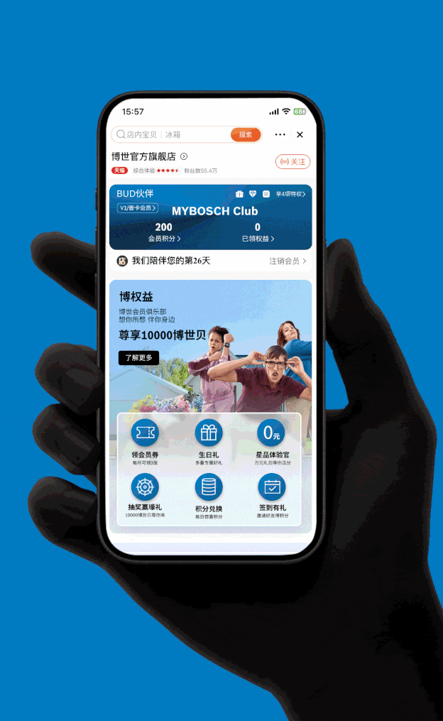
MyBosch Club
UX drives CTR from 6% to 20% by designing a couple of touchpoints for the warm, fun, simple and sophisticated Bosch Member Club
OVERVIEW
MyBosch Club boasts 5 million members in China and serves as a key platform for enhancing customer loyalty across various business sectors by offering exclusive benefits and services.
To increase the number of new additions, MAU and data collection of members to MyBosch Club, we carried out a user-centred research and design approach to identify opportunities on Tmall Platform.
Role
Lead Product Designer
Consultant
Tools
Figma
Microsoft Powerpoint
Timeline
1 month +

CHALLENGE
My exploration started from the communication with stakeholders and the first glance at the MyBosch Club page, and then I found that the page with old-fashioned colour palette, long paragraphs, small texts, unclear call to action and no priority between sections.

“MyBosch Club page is ugly and the data has barely grown in three years.”
— MyBosch Club Team

PROJECT TIMELINE

Our UX journey encompasses researching user needs and market dynamics, ideating creative concepts, designing user-centric interfaces, and testing for continuous refinement.
RESEARCH
To better address these questions, we had to understand how Bosch users perceive the membership club. We conducted 5 interviews with member users and collected 271 quantitative data on the Tmall platform. Our objectives were to understand why users join or not join the membership, as well as uncover the elements that loyal users care about most.
Top Finding 1
New user’s motivation for joining MyBosch Club is weak.
Top Finding 3
Bosch brand is attractive.
Top Finding 2
Users with high loyalty expect long-term service.
Top Finding 4
The focus on single product do not help cross-selling.
IDEATION
I transformed Top Findings into a How Might Way approach with stakeholders in a 3-hour ideation workshop for brainstorming and getting everyone's ideas on the same page.

INFORMATION ARCHITECTURE & WIREFRAMES
Based on the research and ideation result, I started to create the information architecture and wireframes to have a preliminary idea of the future MyBosch Club page. It is a crucial step to align the features with key stakeholders.


DESIGN SPARKS
1
Strengthening brand value
2
Expose benefits right at the entrance
3
Page restructuring
4
Others
1. Strengthening brand value (Visual & Writing)
As users recognize the Bosch brand, revising the visual design and writing is an important step in enhancing the brand image. Branding of visuals and tone of voice will also have long-term positive effects in terms of recognition, loyalty and growth.


2. Expose benefits right at the entrance
From “Join MyBosch Club” to “Releasing Different Touchpoints”, guide customers to the Membership Page.

Before

After
3. Page restructuring
I prioritized the unorganized features in an order and separated out the head, neck, body and feet distinctions for each section. Now, members can quickly recognize and achieve the next step as soon as they come to the page.

4. Others
Low-value gifts with Bosch logo
Visualizing Bosch membership levels
Building a scenario-based shopping experience for cross-selling

PROJECT RESULT
In the short term, significant improvements in data have been observed through the interactions by various appealing touchpoints, leading to increased access to the membership page.

CTR(Click-Through Rate) from touchpoints to MyBosch Club
In the long term, stakeholders continue to monitor data trends and are focused on developing additional valuable long-term services. For example, more service-based gifts, customized content recommendations, etc.